It started off with a sketch.

Which became another sketch.

Which gave me something to do with that horrible monstrosity:
I considered painting over this- but I decided to take a different route. A route that I hadn’t travelled since college. I decided to glue paper to the canvas and create an unconventional painting surface. Since originally the guy in my sketches looked like Jesus, and the painting was going to symbolize various things (I won’t go into it, but you can look up the meanings for owls in the bible and all of that nonsense on your own if you like) I decided to make the paper fit the subject matter. So, I spent a whole night tearing out pages from The History of the Church of Jesus Christ Latter Day Saints and cementing them to the canvas. It was meant to be… as the book had a perfect number of pages to cover every inch of the canvas with none left over.

Wow, that is one shitty looking Owl, huh?

Okay, we’re now a little better. The owl’s body looks like it was based on a cat’s though -so this is no good. I should mention that at this point I was still eyeballing and gridding everything, so proportions were constantly fudged. Hey, I know… how about if I add some flames! Yeah, that’ll fix that owl!………

Um, no. No, that won’t work, stupid… How about you step back and study Owl anatomy a little more and start over (but I liked the owl’s face!)….

So, as you can see above I took a day or two and did some serious owl anatomy studying. Much improved from before, right? Count the feathers in the wings, there should even be the right amount of feathers now!
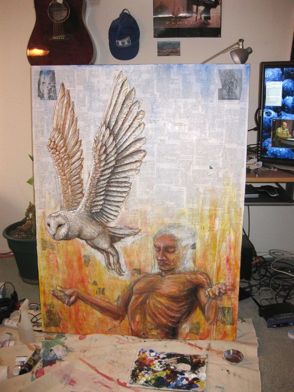
Once the bird started progressing I decided to work on the human. I decided to make him a Native American since he was starting to look more and more like one. I liked how the paint looked on the rough paper. The features on the face look distorted. In the photo above you can get a sense of how I work on these large canvases, I get right up in there. What that also means is that I lose perspective and body parts can become distorted. I don’t notice until I step way back. However, I decided to keep the face distorted, because the rest of the piece was heading in that direction.

I had a devil of a time trying to figure out what the background would/should be like in this piece. It changed as I went along.

Eventually I settled with some crazy mountains in the background and bushes/brambles in the foreground.

This piece ended up looking really strange. There are many elements I like – but none of them seem to fit together very well. Even the hair, which I’ve done successfully in the past, looks bizarre; like some kind of black waterfall cascading over rocks. I was also unsure what to do about the bird’s smaller wing, which appears much lighter in color. I decided to leave it that way as the sun could be shining through and change the color. Some nice elements that you can’t see via photograph are the tiny details in the brambles and how the underlying paper and thinner layer of paint makes the man’s skin seem more thin and luminous.
