Last night, Sam and I walked the downtown Art Walk. We got started about 90 minutes earlier than last time and were able to walk more briskly before the masses showed up. Unfortunately that also meant that most of the food trucks (which we’d planned to check out) weren’t even “open” (in this sense literally opened up) yet. We ended up eating at Lunchbox Cafe, which replaced what used to be a Persian restaurant in the same location. The Persian food had been garnered had the same apathetic reaction from my taste buds. Sam’s bulgogi bowl was better than my Salmon box – but neither was anything to write home about. I should mention that this is another in what has become a tradition of her judgement of menu item picking being better than mine at a new restaurant. She almost always ends up with a better dish. In truth, even when she’s been to the restaurant before and recommends something I usually go my own way – and then end up with a jealous stomach eating some lame meal all the while watching her munching on what she told me to get. Maybe I just have a tendency of shooting myself in the foot. Wait for a few more paragraphs before you make your own judgement (I’m about to rip on another artist publicly – this doesn’t always end well…).
The Art Walk wasn’t as good as last month. However, there were a few interesting changes. Where the shittyness of the Stein gallery used to stand – there were now two or three little “boutique” mini-galleries that actually had interesting pieces. Mostly by artists that were also appearing in other galleries around town already. One piece (of which I didn’t capture on film) was laser etched into poplar. It got my mind wandering and wondering if that isn’t just-the-thing for a certain Adobe Illustrator Fonts-as-Art guy that I know.

Another interesting addition was the Bang Gallery, which seemed to be wholly dedicated to 80s nostalgia pop-art. Every spare wall had been attacked by graffiti artists with random monsters or mash-ups like PTM (Powdered Toast Man… boy… try to explain THAT one to someone who never saw Ren and Stimpy…) with cookie monster in a headlock. It was clear that one graffiti artist had skills above his peers – actually using (shocking!) things like shadow and color mixing. Here is a panda on a high wall by that artist:
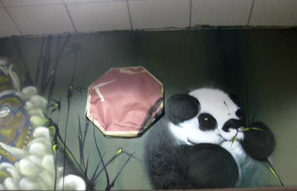
A lot of the hanging art was pop / current events based stuff like a “tron guy” portrait recreated in plastic beads. Researching it later, it turns out the artist, Ariel Erestingcol is quite famous for this kind of work – at least locally (although when “locally” is Los Angeles, that’s good enough, right?). I gotta say – I just don’t get it. Maybe I’m not supposed to. There were tons of similar “Warhol inspired” pieces at this gallery. Does this genre still sell? Is that why these younger artists are doing it (again)? There seems something less creative in sticking your finger in between an original piece (a photo from the internet of “tron guy”) and the the viewer (looking at the same photo, but recreated in beads) and calling it an original creative work of art (of yours). You did “something” but it just seems distinctly lacking both imagination and skill (although I’m sure there is some element of “skill” to assembling the beads). For example, one could make up any number of “modern art pieces” by taking existing ideas and funnelling them through a singular process. How about pet portraits made out of dyed pet food? How about blown up photographs made by taking pinhole photos of movie stills? How about taking fallen leaves from trees in September and arranging them into a 10’x10′ portrait of a face on the floor of a gallery. All these things would surprise no one to be found at an art gallery, but compare them to an Andrew Wyeth painting and suddenly you have to reevaluate whether art has only one level (i.e. it is or isn’t art), or many levels of quality.
Although this is not Ariel’s artist statement – one can assume the description of other artist’s works in the genre goes something like: “I take memories from our collective childhood and process them through the means of childhood creation (beads, etc.) for a true understanding of the media and relating to the subjects on their original level.” How is this a new thought? Wouldn’t it be something new and different to take these childhood memories and translate them to an adult level? Wouldn’t it be more enlightening to study those memories and associations under a NEW light? In fact, this has already been done,by Dave Devries, and the result is all at once much more entertaining, interesting and valuable (as purchasable work, to me). Yes, not all (in fact probably most) of Ariel’s work is NOT directly imported from 80s cultural memory. I don’t want to single him out – he was just the best example from the gallery of a growing trend in the art world. The point I basically want to emphasize is that, in my opinion, when the process becomes the only value of a piece – the piece has no value.
But, again, I’m not expert in the field, I don’t even have an MFA, and my own work probably could not stand up to easy criticism.
 One piece I did like in the gallery was a basketball painting by Justin Bua.
Here we see Justin taking a popular subject (note the player is even wearing Laker colors) and interpreting it through his unique lens. The piece is artistically well produced, both in skill and arrangement. This arrangement was made by Justin – not a source photograph (as far as I know). That means Justin had to use his artistic spirit in making the decisions. He had to decide how to use color, spacing and perspective to make his point., which is a dramatic but simple example of my perceived difference between what makes a piece “pop art” or “real art.” Note the medium here is not an integral part of the message – the piece isn’t made from torn up chunks of jerseys, painted on flattened basketball skin or anything distracting and ridiculous like that with which a lesser artist would attempt to add value to a piece with.
There are always attention craving crazy characters at the Art Walk. This one was no different. We saw a man (or woman?) in costume on stilts and another in a generic beer bottle costume. I didn’t think of it at the time, but the beer bottle actually reminds me of an anthropomorphized Bob Dob character – or the work of a similar low-brow artist.
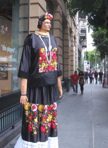

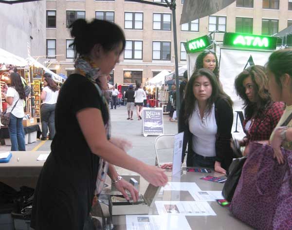
Later we strolled by the parking lot “art fair” and discovered that there was now a price for admission. The sign on the Regent across the street saying the space was available for lease after their attempt at charging admission was apparently oblivious to these “smart businesspeople.” Although there are sometimes some interesting things inside the little fair, we didn’t think for more than 2 seconds about strolling on by when faced with an entrance fee.
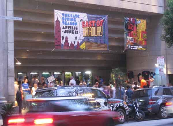
Down the street a little bit more was an apartment building that had discovered its location in proximity to the Art Walk and invited its tenants to display work in the lobby. Unfortunately not a lot of actual artists seem to be living in these “artist lofts.” I snapped a photo – you be the judge:

The atmosphere was loud and festive though – with strange looking characters hanging out. One resident apparently is bad at rapping and decided to use this opportunity to show us just how bad (sorry, no video!).

Once again there were live bands and DJs setting up shop all over the place.
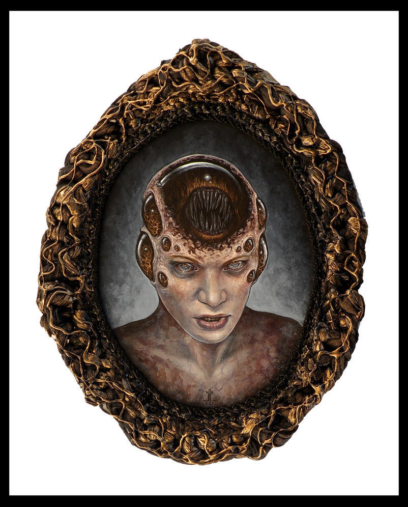
We finished off the walk with the Temple of Visions and Hive. Temple of Visions was a bit disappointing in that almost none of the art had changed from the previous month. The Hive had some very interesting pieces. Some of these artists were the very same that impressed the art world (and me) at Copro last weekend. Joseph Larkin was one of those artists – whose attention to detail and ability to render surfaces is very impressive.
The other standout was Crystal Chan’s piece called I Will Take You Beyond the Familiar. We agreed that although her friend (boyfriend?) Jehan’s work is good in its own way – Crystal’s pieces seem to have more depth and capture mood better. Stylistically, although their works are similar, Crystal seems to be out in front as well with more finessed brushwork.

Lastly – here is Sam pointing out my piece – which is easily lost in the sea of work on that wall. Especially since mine is a pencil drawing. Just being in the same room as the two artists/pieces above is an honor though as I know I’m nowhere near their skill level.


One thought on “Art Walk June”