Since Sam was in China I attended this month’s Art Walk by myself. My first stop was the “last bookstore,” which, unlike what I predicted last month, was still operating and seemed to have more books than before and things like fake wooly mammoth heads on the walls.

The bookstore is on the first floor of the Spring Arts Tower. The gallery upstairs is technically called the mezzanine gallery I believe, but I always just think of it as the “upstairs” gallery. There is usually nothing worth seeing up there. I think the building used to be a bank as there is always an old bank vault (or something that looks like that) in one section. Lately they’ve been putting “artwork” in the vault. Below is what they had this month:

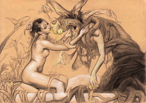
I should mention that there is now a regular artist at this gallery that does nothing but goldfish watercolor paintings. I like her work, so I shouldn’t say there is NOTHING worth seeing up there. This month there was one more piece worth seeing. Uziel Duarte had a painting called Hers. His web site is terribly unfinished, so here is my crappy shot of his piece below:

I stopped taking “Good” photographs of paintings a long time ago. 90% of the time if you take a picture of the piece (to remind yourself what it looks like) and then a photo of the tag you can find a good image online. I’m always disappointed by artists like Uziel who can’t get their digital act together; if only because it takes me more time to write about their work.
Next, I came to one of the many food truck and art fair parking lots. The grilled cheese truck was making another appearance, and like every other, even though I was there extremely early – the line was already down the block.

At this point I’ve gotten used to stopping by the booth for Branch of Life and chatting with the owner. This month, however, he had half a booth stuck directly in front of a DJ speaker (how annoying!). The owner wasn’t there, but I helped someone who was manning the booth (his sister maybe?) set things up so I could snap some shots. She said that he was set up with the rest of the plants in another parking lot. I looked in every parking lot I could find – but never found the other half of the plants.


Down Spring Sobe was setting up their “Event” again in the same parking lot they always inhabit. This time there were more arts and crafts vendors (they seem to be spreading the vendors out now instead of bunching them up in one parking lot). Far off to the right was a large delivery truck converted into a makeshift gallery. I expected a bunch of crap (I mean.. a delivery truck? c’mon..), but I was surprised with this:
Down on Main the old bank building was open but very dark inside. Upon entering I saw many open umbrellas mounted facing me and a large framed print that said “Storm of Life is a continuation of Biagi’s recent series of works examining common cultural superstitions – – their origins and the stigmas attached to them — while questioning the extent to which we let these notions infiltrate and effect our daily lives, and how we can unconsciously accept them as dogma despite their unfounded nature. The exhibition as (sic) a means of liberating the artist (sic) own fears and irrationalities (sic).”
I entered and started wandering through Mattia Biagi’s – Storm of Life.


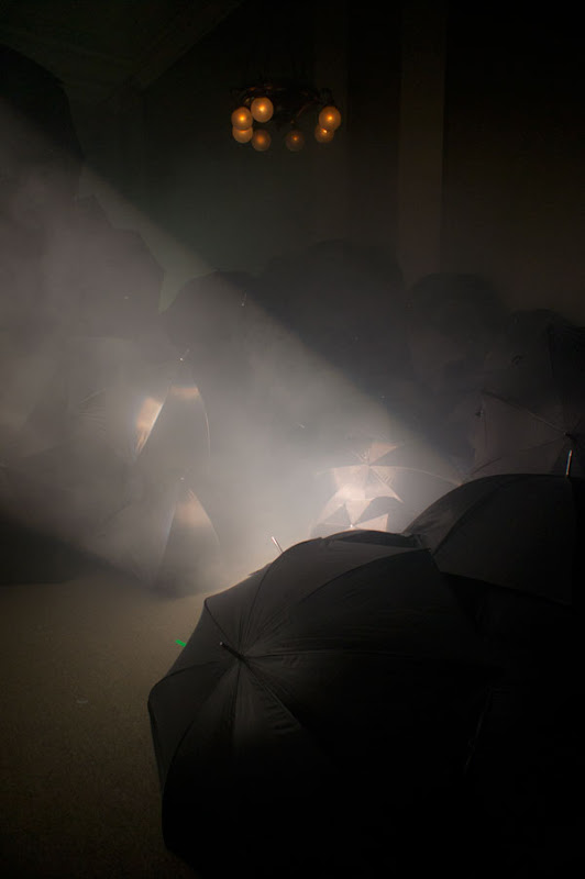
Through generous use of projection, umbrellas and fog machines the artist succeeded in creating a surreal other worldly experience. In thicker fog banks it was easy to lose my orientation. There were projection screens at various locations showing some kind of female knife throwing documentary (or something like that).
When I got back on Spring I headed west. The truck below announced the location of the Blue Canvas show:
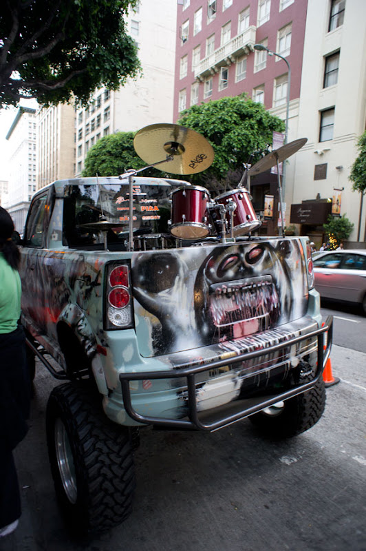
This month Blue Canvas had moved their show to the old Los Angeles stock exchange building. I’d always found this building interesting from the outside (the big ornate gold doors alone grab your attention), but the inside was amazing. The architecture both outside and in seemed a mix of different influences but made me think of Egyptian and Art Deco. The show started off downstairs with a hallway filled with the usual customized Scions that are at every Blue Canvas show.

In the adjoining room was the art gallery. Below are some of the best pieces.
The four pieces above were by Soey Milk.

The two pieces above are by Rodrigo Luff – but after looking him up I found some other even more amazing pieces on his web site. The piece below really struck a chord – but maybe just because I’m now halfway through reading every single work of H.P. Lovecraft on the Kindle Sam gave me.
There is a large stairway just inside the front door of the exchange building that leads to the second floor where the actual trading floor used to be.


The old trading floor is now an upscale lounge with a giant dance floor that can be rented out. Blue Canvas used the dance floor for live painting demos and the lounge areas for more gallery space as well as live digital painting demos and live tattoos. Because of the architecture it’s a very impressive space to walk into.


Walking around upstairs I said to myself “my god, this looks familiar”… thought about it for a minute… “this looks like the club scene from Social Network.” But then I told myself that I was just imagining things since surely that was a San Francisco club..right?
WRONG! That scene was shot in the very place I was standing:
It turns out the old stock exchange is now a club/lounge called Exchange.

The artist doing the live body painting (as opposed to dead body painting) actually had a piece at the hive a few months ago that I liked. I’m not sure what she was going for here as when I was there all she was doing was covering these women in black paint. Maybe she was going to wipe away some kind of tribal design later?


I spent a good amount of time on the steps in front of this massive screen waiting for people to move out of the way. Then I realized it would make more sense to have a crowd shot so the scale could be seen. If you don’t recognize what is on the screen – that’s photoshop. It was a live digital painting demo. An interesting aspect of this screen in the dark room was that when a pixel was not lit (black) the screen functioned as a mirror. Below is a show with the actual artist doing the demo there on the right.
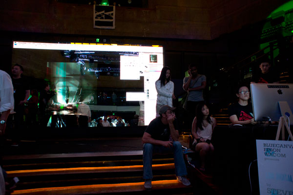

Above you can see Captain Obvious making another cameo appearance in my photo by pointing to the screen showing the closeup of the live tattoo obviously being done right in front of him and his friends.
Down Spring a few more blocks was the Temple of Visions. I think the art was new this month – but I’m unfortunately getting tired of the trippy hippy stuff.
The above painting is by Mykal Aubry. I tried to get this image off his website, but he had a proprietary image management system that obscured the real file name/location even when you look at the source code. I’m curious whether he did this on purpose – as it was quite easy to get the image from his facebook page… thus negating the effort he took to prevent people from “stealing” images from his personal web site. For that reason alone I’m NOT posting a link back to his page. Facebook doesn’t tell you when someone links to your photo – so he’ll never know I’m “stealing” it to put on my blog (unless of course he was smart enough to sign up for Google Tracker – in which case he’ll see his name in this blog entry).
The image below is of some man-size 3D box with multiple color shifting pieces. No idea what it is supposed to signify.

The Hive next door was so packed it was hard to get in and out of. There was a Tarot reader outside as usual:

and three live painters/airbrushers

Near the entrance (past the first two featured artist walls) was this crazy giant head by Alex Chiu called (what else) Big Ass Rainbow Head:

Below are some of the pieces from this month’s show that I liked:
Salah – Pleasure of the Hunt. Salah is always making sculptures of Asian women in various states of undress, which is something I naturally can’t complain about, but she also gives each one a personality. A lot of them are “animial spirit” warriors like the one above with accessories and a great paint job. The poses are always interesting and the details are intricate as these pieces are never more than six inches high.
A left over Chiodo Killer Clowns sculpture from last month.
There was one piece that really stood out. The painting below by Alan Kocharian reminds me a lot of Audrey Kawasaki’s work. Considering her current status on the new-brow scene that is a high compliment.
What you can’t really see is that some of the small lines in the piece, like the edges of sections of hair, were painted with (or etched away to reveal) brighter metallic colors to give the piece an interesting intricacy of detail that isn’t usually seen. I’m a fan of these amorphous scratchy backgrounds in figurative work. Perhaps I should try developing my own version of this as I always struggle with the backgrounds in my work.
Then, of course, high on the wall deeper in the gallery was my contribution:

My goal for this show was, after giving up on my “robot graffiti artist” piece, to make something really wacky from one my sketchbooks. I had a sketch of this strange shaman figure riding around on a floating organic platform.
I didn’t intend to make the platform so phallic – it just turned out that way. I’m also uncomfortable with how the little flying blue guys came out – I’m still having a tough time making tiny details with acrylic paint. The birds and spaceship were late additions after the painting was nearly finished as the painting seemed to need something to balance it out on the left, and the entire blue sky seemed too empty. Plus, I figured if I added a spaceship the viewer could at least imagine a story for this character – that he’s an alien from a crashed ship… something like that…
The hands coming from the platform weren’t in the original sketch – and they probably should have stayed that way. They (along with that reptile critter and his blue flying friends) look way too cartoony. Looking at it now I can also see that the background mountains are too bright.
I’m going to have something completely different for you next month – and at the same time I’m working on a more “traditional” larger figurative piece.


